DO-S BANCHOUUUU

DO-S BANCHOUUUU
I awakened my inner Do-M thanks to this^ guy.(they took down their horizontal banner so =/)

Friday, August 7, 2015

Happy SG50! - Majulah Singapura - Ar(red)ngement-

HAPPY SG50!!!


Original:
Majulah Singapura
National Anthem of Singapore
Composed by Zubir Said, 1958

Midi: Hamienet
Arrangement: nova
Vocaloid Manipulation and Mixing: Akairi

I've always wanted to make a weird arrange for the anthem, and here it is! Don't let your dreams be dreams.

Paused my other Process Logs to do this one first, cause it is two days from National Day!!!

I was wondering what kind of VB to use, but I stuck with Miku_Original because it's her most vibrant VB in V3. Miku_Solid is a hit and miss for me cause it's too shout-y and unclear.
I used pitch snap mode this time... She still doesn't sound very robotic to me though lol have I been desensitised??!!
Wanting a slightly faster arrange, I set the BPM of this to 124.
I still don't know how to mix and master so it's really lousy when it's just me clicking random stuff and if it sounds ok it stays set lmao. Actually I can't even read music cries I TRY THOUGH withe the pdf file on the MINDEF's site... it was so hard.... too many beansprouts...
I want to do another rearrangement again!!! Hopefully more drumstrep-y!! But I would have to learn music first lol and nova too i guess.

If by any chance someone wants the VSQ just ask me!

If you're wondering: "But Miku is a Vocaloid by a Japanese company tsk it's not a tribute at all" Read my comment on the YT vid:
"Well Vocaloid is an instrument after all, so I hope people will understand where I'm coming from when I decided to make this. Sure Miku is a Japanese Vocaloid by Crypton, but then and again I'm sure we all use instruments/paint/devices from all over the world to make tribute stuff yea? As such please see this arrange as a separate work from the normal "Vocaloid covers". The option of using my own voice is rejected, not all of us are The Voice contestants alright."
Which is also why I decided to not make Miku the main focus in the name of the video title and didn't tag her. It would be a really good clickbait if I did though lol.
And if you still find fault in my decision here's another reason: Because I can. And I hurt no real person in the process.

I really love the design of the bag!!! To those who are unfamiliar with it, it's designed to look like the traditional Chinese calendar where we tear out the pages everyday. It brought back a nostalgic feeling for me actually, cause I do remember my late grandparents on both side using it when I was young. The date is set to 9 August 1965, where Singapore got it's independence. When I showed it to my mom said why,  because I can only use it during National Day every year but TO HELL WITH THAT PEOPLE CARRY UNION JACKS ALL THE TIME TOO SO I DO WHAT I WANT!!! 
If you like the bag too you can get it here. It's designed by Olivia Lee!
The photo was taken by me on my iPhone(btw when i tried updating to iOS 8 this week it pulled shit on me and told me that it couldnt be updated and i had to do a facotry reset SO I LOST ALL MY PHOTOS/NOTES/APPS DATA FOR THIS YEAR OH MY GOD I HATE APPLE), then pulled some filter on it lol.

I've put this on the YT post too: 
I saw an interview on TV with Mr.陈 (sorry it was too fast for me to catch his name) and being in his 70s now he talked about the time from WWII till Singapore's independence(1965). SG was under Japanese control during WWII, so he had to sing the Japanese anthem. After the war SG was under British rule again, and then he sang the British anthem. During the merger(1963-1965) with Malaya(now Malaysia), he sang the Malaysian anthem. And in 1965, he sang the Singaporean anthem and has only sung it ever since. After hearing his heartfelt story i now see the anthem in another way; it's really amazing how the current SG is has people born into vastly different generations to be able to hear stories from our elders like this. I'm really happy. I also recently learnt that my late maternal grandmother was a Samsui woman that's cool.

I won't live till SG100, but man am I curious as to how it'll be then.

Saturday, July 11, 2015

Paper Cards Process Log #1

Righto, after my recent endeavors with making my costumes and stuff, I thought that making process logs for my past stuff would be good too. Which.... I have alot.... this is the first post! I'll probably start with craft first then ahahaha.

Paper Cards Process Log #1

So I started making these kind of paper cards around May 2014, and for the next six months I made quite a fair bit of them XDD (i always get carried away....) I made them with the intention of giving it to someone else, so I keep none of them and that's fine with me, I do hope the ppl who received them would like it!

This was my first paper dress card ever:
I made it for a classmate who (i wasn't close to her at all but you know, the teacher tasked me to do and THEN I ALWAYS GO OVERBOARD....) but I'm happy it made me realise I love doing this kind of useless crap thing too.

I'm just gonna make summarised steps in point form so I can copy-paste them again, cause it's basically the same method, only different variations in designs

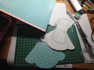
  1. Draw the design on white drawing block, then cut out the silhouette. This will be your base and if you're going to write messages on the back do it now.
  2. Trace and cut the parts on the respective patterned paper you wish to use. Pay attention to the patterns that would be cut!! Also, I would separate parts of the clothing according to how they would be sewn IRL (if you know how clothing works, you'll get what I'm talking about. But if you don't, uhh just look at your flattened clothes and identify the different pieces of cloth that were sewn together)
  3. Glue the patterned paper onto the drawing block base, also please take note of the order that you would be gluing the pieces in, for example, I will always glue the sleeves below the main bodice of the shirt. Also I usually glue the skirt base below the main shirt bodice too. 
  4. Glue on the lace and other decorative stuff.
  5. You're done! Now you can finish by attaching strings to hang your dress or just leave it as it is!!

For this piece, there were a total of 5 different patterned paper, one for the while shirt, the pink suspenders, the skirt, the collar and the strawberries. For the collar, I had to carefully choose from the paper itself because the tessellations of the pattern itself was really funky (does this make sense idk i tried to phrase it as normal as i can). there's thin white lines on the skirt, and then yea some white lace on the shirt. The skirt has scalloped hems!!!

I'm not sure if you can see it from the pic, but the skirt part pops out, i did it by cutting a larger piece of paper for the green polka dot paper, then gluing the ends to the base. the paper will get pushed out on it's own!!! and then glued gathered lace inside so there's no awkward space hahaha.
(srry i didn't take photos while i was working on it so no WIP shots, cause i didnt expect it'll turn out so nicely www)
--------------------------------------------------------------------------

I'm not really fond of this, I am quite disappointed actually.... but yea another classmate saw what I made and she wanted one in blue so here it is.....

White drawing block base, patterned paper
Finished dress! The lines on the bib were drawn in black pen and urgh it looks so ugly.
FLUFFY SKIIRRRTTTT
the more i look at this the grosses i feel it is urgh.
--------------------------------------------------------------------------

I made this for a really special friend of mine!!! Her initials are P.Y! The stuff she draws and mails me are gorgeous I'm so touched everytime ;w; (speaking of that I haven't mailed her this year... ack....)

This time I tried to do somthing new, which was to add a face to the dress. The dress wasn't very detailed for this ahahaha 8'DDD

Drawn using watercolour pencils!
Cut out silhouette of hair and did some shading with watercolour pencils.
ok earlier in this post i said smth about choosing patterns right? So yea here's an example of me selectively using patterns to make a bow, i didn't want to just cut a silhouette of a bow from the piece of paper cause it wouldn't be nice. :((((


Looks a lot better than if I had just cut out a silhouette...

To get her ears to show up behind the "feelers", I cut the hair up to a point, then slotted the face such that her forehead is behind the fringe and the hair goes in front of the ears.  For this the sleeves were glued in front bc i wanted it to look puffy but mmeeeeeehhh i'm not happy with it =/
It was a card so i pasted the white base to another piece of decorative paper!

-------------------------------------------------------------------------

Time-wise it takes an average of 5 hrs for each card! Cause you gotta draw, trace then cut the small parts, it can get real tiring! (and i'm not very good with the drawing part so I take a while laughs weakly)

There's more paper cards here! They're all anime/manga character related though but do take a look!:
(Paper Cards Process Log #2)

Sunday, June 14, 2015

Yuri Kuma Arashi ED TERRITORY Miku Cover Process Log

Ok this is a few days late but whatever I didn't even plan to write one for this at first.

So, yea my first Vocaloid cover!!! I was insistent on it being a HachioujiP-related work, because well, that man ignited my burning passion for VocaloidPs years ago and that led me to where I am today. (If you knew me well enough you'll know everything I did for him for 2 events when he was here in SG. I AM A BIG HACHIOUJI-P FAN!!)
Laughs I only knew about YKA because he was in-charge of the ED, but I found myself really loving the anime a lot! if you wanna talk abt YKA you're always welcome i love Lulu and Mirun and Yurizono  It has really intricate art and the tessellations are easily my fav thing. To me, it's not a character driven show, so I treat the characters more like representations. Anyway---


Composer: 八王子P
Arrangement: DJ’TEKINA//SOMETHING
Lyrics: はいのことん
I used Crescen♪o's midi to help know where to put the notes. in the end i messed up anyway i'm an embarrassment i'm sorry

Tuning Part

Just a heads up that I am practically 99% music illiterate. And most probably tone deaf. This is just a process log I think my methods grate the ears of musicians.

Hmm here's what she sounded like at first when I did the midi and input the lyrics and stuff:
If you're music literate unlike me, you'll know right away that it's slow and longer than the original.
Well I didn't realise it and just went right ahead to tune. Man was I in for a huge shock when I tried to match up my finished tuned vocal track with the instrumental. so yeeeeeeaaaahhhh *redos everything for the 19329864th time*

Oh this was a realisation that I had after uploading everything and was working on my current cover: After Jing's suggested to look up on keys, I realised I had made a huge mistake in music. Miku is actually off tune with the music and the major she is in is totally messed up. This is because after importing the midi I simply dragged all the notes down without any regard to changing the notes to suit whatever key I was going for.
please be proud of my new discovery; i read so many different explanations trying to understand what the hell are chords
I'll stick to original keys from now on lol everything i touch dies.

I keep using small bits and pieces of notes to bend the pitch so uhhhhhh idk if it's ok??? Original sounds alright with this method, but when I tried it with Dark, Soft, Sweet, she sounded even more horrible than she usually does (yes i love miku but c'mon we all love flawed humans too right *vague shrugging*), but for pitch bends that use the parameters they sound good, especially Dark ohhhhhh boooy i love Dark's pitchbends.

It's like I do the dumbest shit in every upload I make. This time I didn't realise that the instrumental for the song in the ED single was for the full length song only when I bought it. So yeaaaa.... I had to cut the instrumental and piece it like it's some jugsaw. The front part i got from the anime(the original instrumental didn't have the 'uwuwwwwwuuuaaaaa' part and hey i like that part ok.)
But ok the CD design is really cute-pretty and I'm adding it to my HachioujiP CD collection so I don't regret anything whooooo

MMD Image Part
was based on a scene from the anime:
I absolutely adore the mirror scene(s) ahhhhhhhhhhhhhh so beautifullll the whole anime is beautiful

I really really REALLY love REM-maple's model of MikuV3 so yea using the model in this video was a no brainer!!! I was lucky to find DamianHandy's model of a rifle, and it looks similar to the one in the show so yaaaayy
Set it up, posed miku, loaded a BG img file, used the usual ドゥドゥ, そぼろ, おたもん, ビームマン effects I use...
After remembering belatedly that WorkingFloor doesn't reflect the effects applied to the model (and the reflection IS the main part of the image), I rendered two different images, one with miku's back and the other her front. After that i just combined them in CSP.
The most amusing part was the "mirror reflection" effect duuuuude I just used white spray brush, drew diagonal stripes, erase the parts where non-mirror Miku was at and viola I just bullshitted my way in a minute bravo cheating self.

If you want the image in full res(3840x2160, no text), I've uploaded it here! Under Options, click on Download. Personal use only!

Then yea AviUtl is my BFF in video editing. WAaaaaAAAaaaAAAaaavVVVVvvEEEeeeeforms. Gotta luv waveforms. Bless easy AviUtl waveforms. *bows to KEN-sama*


So yea this was another wiiiilldd ride. Learning new things everyday that's what I live for man.


On a side note, my HQ!!MMD has reached 2,525 views on NND!!! (2525 is ni-go-ni-go in Japanese, it sounds like niconico. they have something like an achievement for it lol)

Tuesday, June 2, 2015

MMD - HQ x GSNK OP Vid Process Log


I spent more than a whole month working on this bloody MMD so damn right you know I am gonna write a long ass post about it lest I forget how I wasted my month away.

Credits
Motion: あああ
Original Dance: RAB
Models: mori, ageha, 皐月
Accessory: Past@
Stage: 九零
Skydome: のるねり
MME: ドゥドゥ, そぼろ, おたもん, ビームマン, 針金, Elle
Special Thanks to Garmus1 and Trackdancer for all their tutorials

Models
Shoutout to Athen who helped me figure out the password for Suga's model (THANKKK YOUUU). Once the gang is all here I subjected myself to days of torture learning PMD for the first time and trying to edit working models w/o messing up the bones and physics. Ok I only did it for Asahi and Suga but it was enough to kill me. (all because i insisted on using the black jersey version instead of their uniforms.) I messed up A LOT and this is prob the funniest screw-up:
Goodbye Asahi
I'm really dumb so it only occurred to me a while later that i should just delete the extra materials like the arm that would be covered by the jersey anyway. Also his fingers looks like the Terminator cause I misaligned his finger bones; it also took me awhile to figure out why on earth it happened cause i dumb.
LEARN FROM MY DUMB MISTAKES FRIENDS
Suga's model was kinda weird cause whenever i deleted certain extra bones or moved the physics it'll crash on MMD when loaded.

Motion
Basically aaa's motions only works with a particular bone build of mmd models; its motion doesn't really use the normal IKs but more of the individual bones itself. If you used his motions on an unedited model like TDAs, etc, you'll get pretty messed up motions where the model will be floating in mid air and the legs continue to float(see the Asahi pic above). There is a way to add the extra bones via 4 plug-ins in PMX for the motions, you can find instructions in section 2.1.3 of the pdf file included in his motion folder(google translate my BFF). Because these bones were kinda forced out with the plug-ins he described, the result is more often than not still wonky and you have to further adjust it yourself. So uhh yea if you really wanna use this motion be prepared for the massive amount of work you have to do(2700 frames x 5 models GG).
Some parts are still ok but pay really close attention to their feet (one of the bones with the name D) cause it really screws up their legs a lot. Everyone needs fine-tuning you can't run from editing the motion for this son and it's like 40% BREAK-DANCING. If you're stuck you can always refer to the original dance and YT has this really neat function that slows down the vid so referencing is easier. Now I have an even greater respect for people who make motions from scratch wow hats off to you guys.


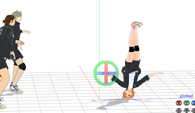
Hinata's turning hand stand part was probably the worst to adjust. Slow-mo on YT is your best friend!

but yea it cool i learnt the basics of PMD and motion editing this time but the workings of PMX still confuse me to no end. *vague shrugging*


I didn't have the idea of putting in the Karasuno banner until I started on camera motions and was kinda at a loss at where to focus after the ball rolling part. (Mori had a really nice banner in one of her vids, But I couldn't find it anywhere). So yea *insert crash course on 3D modelling in Metasequoria and trying to recreate the banner texture here* and I crapped out a flat piece of banner. If anyone wants the banner in .x or .pmx format just holla ya. You'll most likely need to clean up the sides of the PNG texture cause I was too dead at that time to care any more..... in the end i felt that the banner looked really small cause i pinned it to the back of the stage which was really far back..... but w/e man I tried. I can see myself enjoying 3D modelling actually....... i am truly a masochist

MMEs (Effects)
Before vs After. I love this so much i felt really great.
Firstly I added the different MassLight-s to each component of the stage after subset-extract. Alpha_bend, Self_Overlay, bleachbypass, ExSSAO, ExcellentShadow, AutoLuminous for only the exit signs, Diffusion, Cheaplens... yea... Oh even after adjusting the default light source in MMD, I felt that the "sunlight" strength wasn't strong enough, so i added a PostPointLight and moved it to the top right of the stage. It really helped to brighten the parts that had too harsh a shadow. For the models I used different variants of adultshader (cause the models have different textures), but for clothes I used Greenershader-s. I wanted to use my favorite variant of Greenershader but it turned out really weird in this sunny setting... I also decided not to use AutoLuminous for the eyes cause it'll be too over-the-top for this setting hahaha..

The ones who make magic are the people who created all these effects; i have the easy job of just loading everything. Thank you creators so much ;___;

Because the school gym hall stage is a .pmx file, having the MMD program do the shadows for the models ends up with real shitty opaque light grey shadows on the floor(see trackdancer's post on shadows and model draw order). So I turned them off. I wanted to use the WorkingFloorX but when I actually saw it in use it looks too extreme considering the setting.... Then idk what happened next. I didnt register the Y axis value so it dropped to below the floor the next time I played it, and I turned the shadows in its accessory box on and tadaaaaa I got some decent looking shadows that were in the right direction according to where I put my light source. Even the floor looked shiner and that was awesome. To get the standard floor reflection I just used normal WorkingFloor but with Y value adjusted above the WorkingFloorX. It was a total accidental discovery thank you dumb self my stupid-ness is actually useful for once.  I LOVE THOSE SHADOWS MMMM c'mon i even put it there for the 3rd camera scene
LOOK @ MAH SHADOWSSSSSSS

Well you can only see it for a brief second but I added GodRay too. It's my first time using it so at first I was just puzzled why it wasn't showing up... but yea it is a really great effect to use actually, just that it wasn't obvious in my video cause my light source was off-screen...

Camera
The original didn't have a camera that moves so I did the camera myself this time. It would probably be easier if i didn't load the damn 23872424 effects on everything first that makes the program lag when i play it..... *looks up at sky and whispers "why"*
Man my camera motions were so awkward the first few times i did it, i cry every time i rendered it to AVI to check and GDI it was so bloody awkward..... So i redid it quite a lot of times..... i mean i feel it's still awkward at some parts but i aint no hollywood filmmaker u feel so i'll settle.
If you want the camera the download is here! Do read the ReadMe for rules and elaborations on some parts where you have to adjust the camera yourself.


Thank you for reading my WOT! MMD is a wild ride. Learning stuff is always a wild ride. I'm still not as good as I want to be but I'm content with my progress *thinks of my first jojo mmd and shudders*

Friday, May 15, 2015

Official Agnes Oblige MMD Model


I am in love with her face build especially the eyes fnefksdasdfdgakmyBravelyfeeeeelssss Adultshader series works real well with her ^p^ not sure if it's just me though but her shadows are really reddish pinkish that it was kind of an eyesore for me. I doubt you are allowed to fix her textures cause they DO NOT  allow edits and obviously redistribution too.

Agnes Oblige from Bravely Default/Bravely Second model: (C) SQUARE ENIX CO., LTD. All Rights Reserved.
You can download her from Bravely Second's site, it should be on the left corner with a tiny Anges and yea you can see the MMD words in the sentence. Do take note of the rules though cause they DO NOT ALLOW EDITING and also you're required to credit them for use(the phrase in bold and underlined)
THANK YOU SQUARE ENIX!!! Now, if you guys could kindly convert and put up Edea model for DL too... GOD I LOVE EDEAAA AHHHHHHH  But above all pls localise it OTL
The physics for the bottom of her skirt kinda sucks though, I loaded a motion for testing and it kept flying all over the place and I lost count of how many times her legs and hair went through the lower part of the skirt. ((idk if fixing her physic is allowed though HHMMM.....))  but yea other than that it's really beautiful. Facials wise it has the basic blinking, winking, aeiou+smile and some eyebrow movements, but don't expect the super anime kinda expression. (It's more than enough already imo) ARMOR TEXTURE SO BEAUTIFUL I CANT AHHHH

For the above image, I used  ドゥドゥ's edit of GreenerShader_Sun, そぼろ's Diffusion, ExcellentShadow, a hint of AL to her eyes, おたもん's filters, namely afterglow, SSAO.
Mansion stage from elviramoa, the rose arch bまきがね, skydome by 怪獣対若大将P.
Laughs you can prob tell it was done slip-shoddily cause I didnt bother changing the Tr and Si values for some of the MMEs and the lighting doesn't make much sense.

Anyway it was really fun to test her out, I can definitely think of a few ideas for videos to use her beautiful model in(whether I will actually make them is another issue....). I still have my HQ mmd to finish uurrrgghhhh

Thank you so much for the Bravely series games Square Enix! Please localise Bravely Second too!!! ;__;

Tuesday, May 12, 2015

Once-every-4-years blogger

Oh god another 4 years have passed like I know my consistency was shit but I didn't know it was THIS shit. Prob gonna stick to blogger cause I can't be bothered to create wordpress and learn source coding.
Still working on my MMD....... for the past 1 month......... CRYING INTO HANDS ok i admit: last week i just procrastinated and played Ensemble Stars all the way but CAN YOU BLAME ME??!!! BREAKDANCE MOTIONS ARE HARD TO ORCHESTRATE CAUSE THE MODELS IM USING DOESN'T HAVE THE SAME BONE BUILD AS THE ORIGINAL MAKER'S MODELS SO EVERY BONE IS KINDA OFF AND I HAVE TO GO THROUGH 3000 FRAMES FOR 5 CHARACTERS. ok jkjk i know i'm just being a lazy ass and yea I'm back to working on it now. PROPS TO KIND GRACIOUS COULD WHO MAKE MMD MOTIONS cause I can't even bring myself to make a model's facial frames for 10secs. how do ppl even make motions from scratch idek.
I'm really excited to finish this and start on my next MMD cause I already have a plan for it and i'm feelin' kinda great about it. Well i felt the same way about the current one too but at least there's no more break dancing motions to fix. I really really really do want to get my hands on guu11, yamaya and otti's UtaPri models........ god they're so pretty like mori's Noya I WANT IT SOOOOO SOO BAAAAADDDDDD if any kind soul who has one pls send it to me like it's ok if you don't allow me to post up mmd vids using them I NEED THEM FOR PERSONAL USES
I really hope that my level of Japanese will be ok enough so i can start translating some stuff too
........ which reminds me: i kinda put my 31 ai dream translations on hold..... ahhhhh.................... hhaaaaaaa................ haaaaaaaaa......... MY CONSISTENCY IS SHIT, IT'S MORE LIKE CONSHITENCY

Hopefully my next post wouldn't be like 10 yrs later or smth.

Tuesday, November 1, 2011

Okay so....

There hasn't been much progress with this at all URGH. *flips table*
i guess i was kinda busy, i guesss...........................................................

i busy was okay???!!! DDD<

So now i'm back??? in black! jkjk, i wont use the same this i used on my dA. XD
What drove me back to my idea of having a FREQUENTLY UPDATED blog is prolly cause of my addiction to otome games again. Yep, i'm back baby!! XDDD but not yet to yaoi games ATM, even though the dark side has cookies!! DDD<
So recently i'm playing Musketeer. (if you hadnt noticed the banner on top.) currently stuck at athos' route, wanted porthos though. ;^; hahaha i think ash was bored with otomes games cause when she played for like 30mins she was getting annoyed and saying "WHERE'S THE KISSING PART" and i'm like "WAAAAAAAAY BACK GIRL YOU'RE ONLY AT CHAPTER 1 HAHAHAHAHA." she was interested in Rochefort. ;) I'M FOR CONSTANTINE ALL THE WAY!!!!<3<3<3
and also i have Project Diva. i think mine's the 2nd one. I think. completed all songs on normal! AND URGHHH GOD DAMMMMIT HARD IS REALLY HARD!!! i can complete the song, but apparently sega made it that NO, YOU MUST BE REALLY REALLY GOOD AND GET 200+ COMBOS TO PASS. ELSE YOU AIN'T NO VOCALOID OTAKU. wtffffffffffff is this asdfk i don't have average brain-hand coordination okay???!!
and because of Musketeer i learnt how to screenshot on the psp! 8D so hur hur hur within 10mins already got 60+ shots alr. =w=V

Might start on what-ever i was going to do on this blog soon. (like reviews, tutorials and shizz??!!)
MOTIVATE ME PEOPLE. (not that i'll have anyone come here anyway pffffft.)
hey i was trying really hard to figure out wordpress, but i ended up sticking to blogger cause i'm more used to the controls. ;w; BE GRATEFUL.

kk end off here. this post is unproductive anyways.

EDIT: btw, like my header? 8D i made it!~ original art by redjuice, supercell. for Guilty Crown